Typography
Typography brings weight to the stories we tell. The words we choose are important. But the fonts selected to convey them should never be overlooked.
Canada Bold, our title font
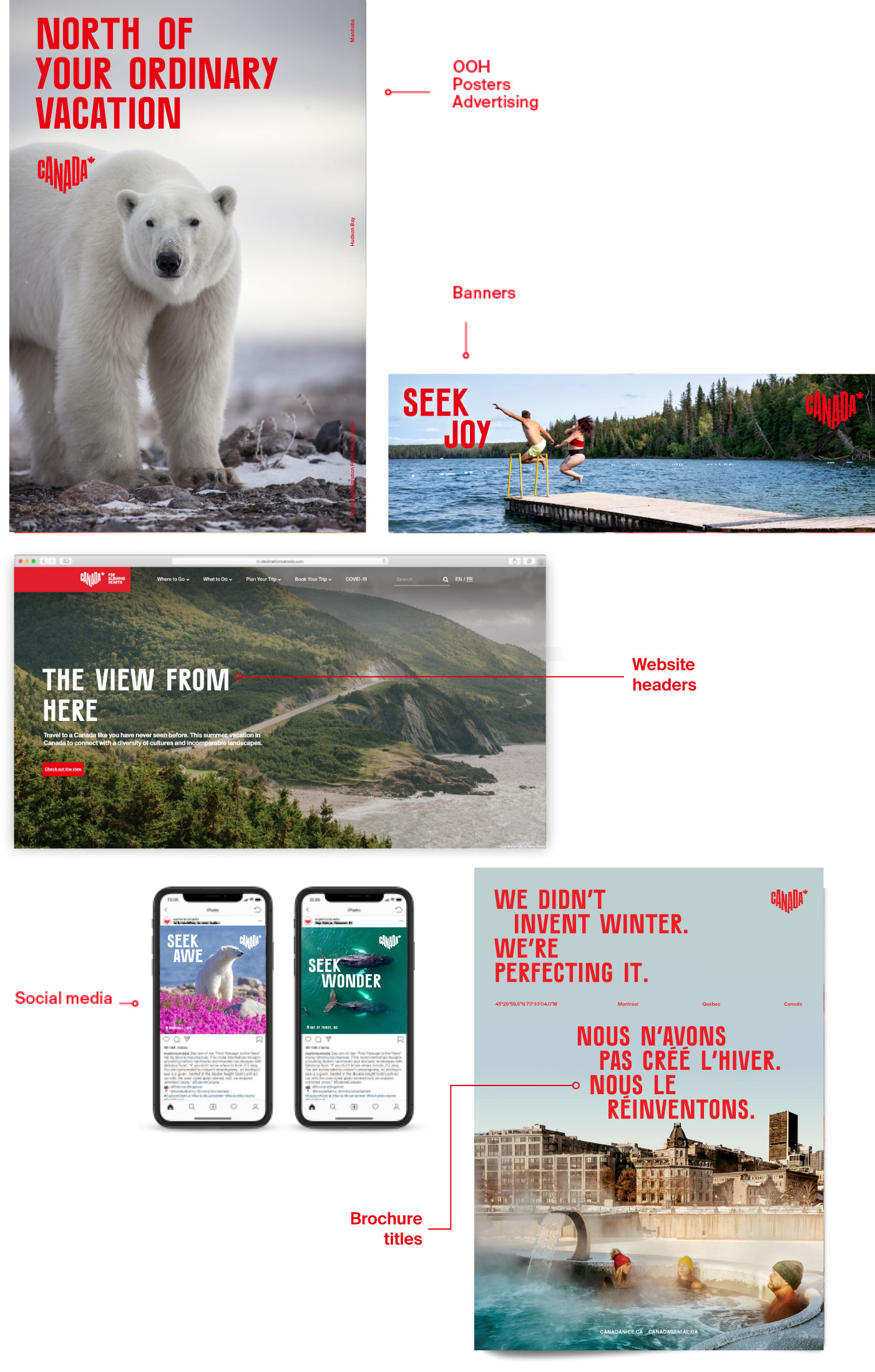
Canada Bold stands out due to its offbeat yet approachable style, used as headlines. Over time, this unique font has the potential to become a strong branding element associated with Destination Canada.
Canada Bold is never to be used in lowercase
Canada Bold is the only weight we use
Canada Bold is not well-suited for long copy.

Suisse Int’l, our content font
Modern and reader-friendly, Suisse Int'l is available in a variety of languages, making it ideal for international markets. As our primary content font, Suisse Int'l is the perfect choice thanks to its versatility and easy-to-read sans serif typeface.
Only use all uppercase letters in exceptional cases
Trade usage of title font
For more conventional usage, block typography should be used and always left-aligned, but can be positioned at the top or bottom.
One word or a few short words per line
Align text left
1 - Line spacing (leading) is 90% (font size x 0.9)
2 - Do not add spacing between the lines
Agency usage of title font
For more conventional usage, block typography should be used and always left-aligned, but can be positioned at the top or bottom.
One word or a few short words per line
Align text left
1 - Line spacing (leading) is 90% (font size x 0.9)
You should add spacing between lines
Text should move from left to right
To ensure better readability, the reading direction must be from left to right.
Photo layout
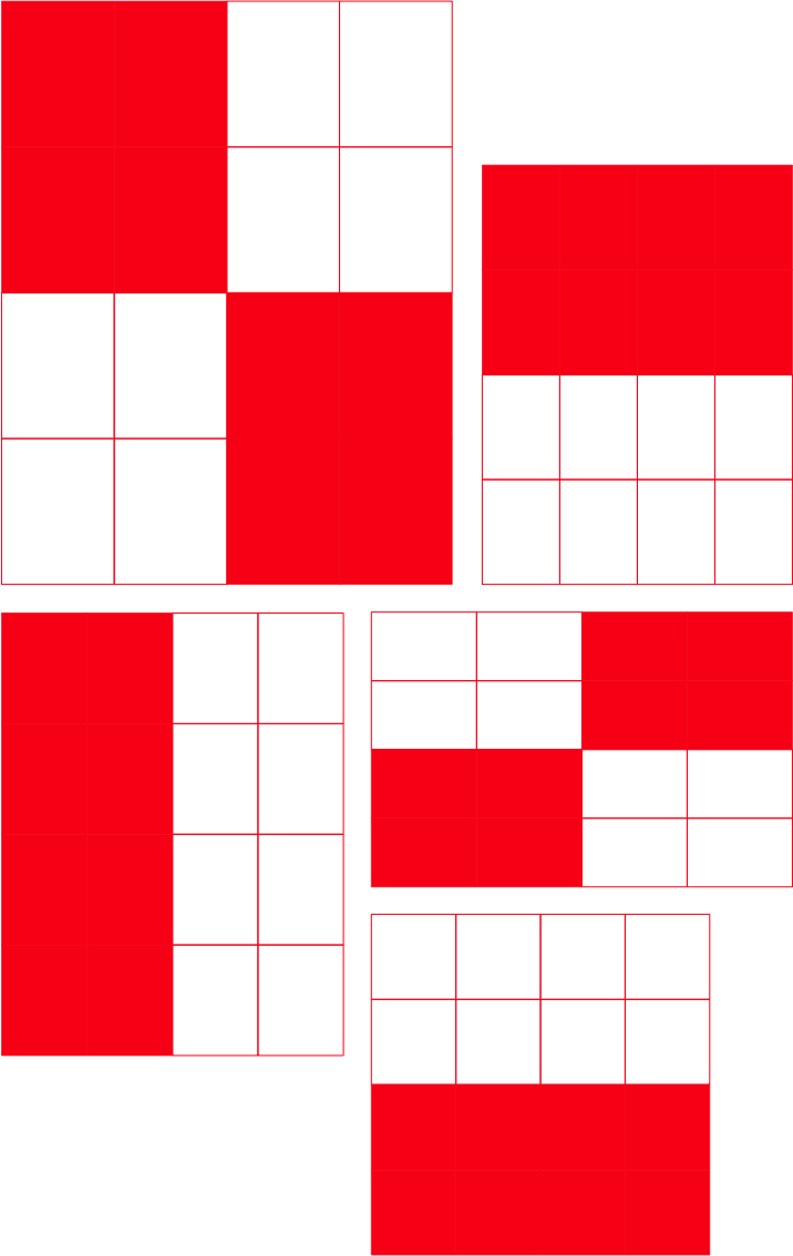
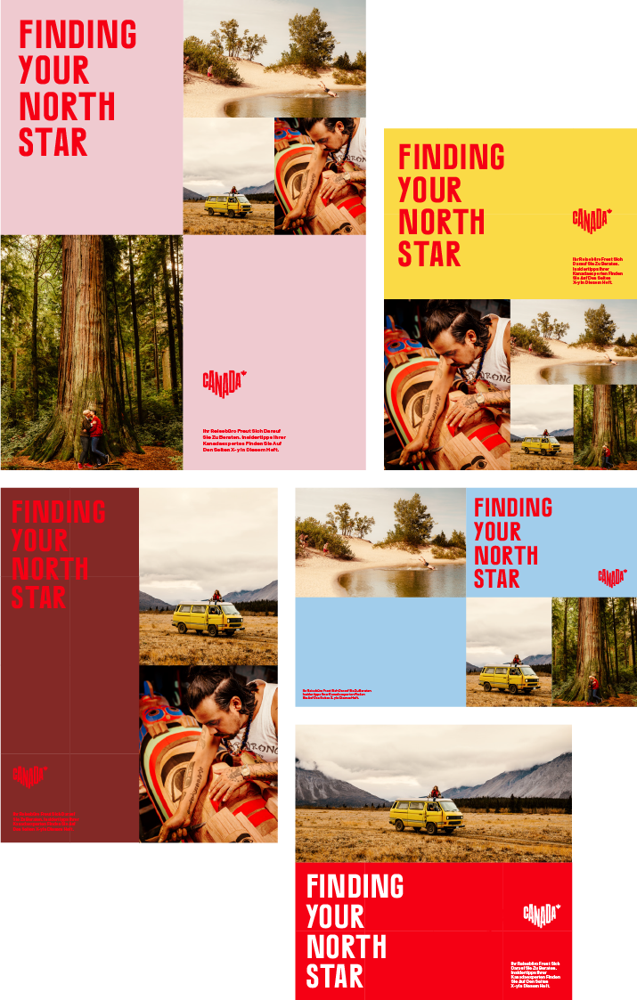
Though a single powerful image is preferred, this layout system is to be used when there are more than one or two photos in a communications piece. The format is divided into 16 equal rectangles. Half the page will be filled with colour and type, and the other half will be filled with images (1 to 4 photos).

Short and simple headlines will work great here
Do not hesitate to choose one colour from our palette

