Graphic Elements
Graphic elements strengthen our visual identity. They are the building blocks that make our imagery distinctly Canadian and iconic.
Our Colours in Action
Our secondary colours reflect the beauty of Canada, but remember that red should always be the star and should only ever be paired with one other colour at a time. Below please find examples of how red can be used on another colour and the reverse
The font and logo should be the same single colour, unless the logo is on a picture, then it should be red
Use squares or rectangles only—see section 2.4.5 for other layout examples
Photo Location Labels
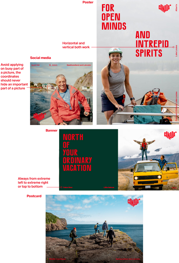
Canada is full of magical places. In order to make them even more accessible, we like to indicate the location from where each photo was taken, in small type, on the image. It must be subtle but readable, like a credit.
Try to include the region/city and province, but if space allows, you can also include the neighbourhood or park, or specific place name.

When spreading location labels across the image, the space between each location must be the same

Font: Suisse Int'l Semibold
Colour: Always red unless on red, then it should be white
Size: Small, but never smaller than 5 pts
Examples:

Logo Pattern
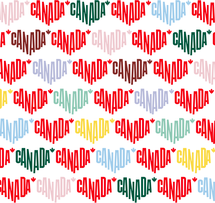
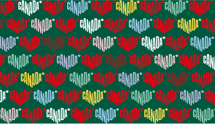
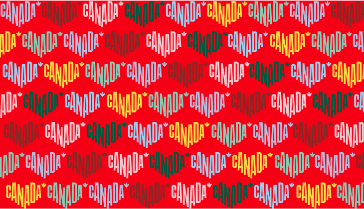
The logo can be staggered, but should always appear in a straight line. Secondary colours may be used, but as always, the red logo must be dominant. Different colour backgrounds can be used as long as all the logos are clearly visible and well contrasted.
Logo Cropping
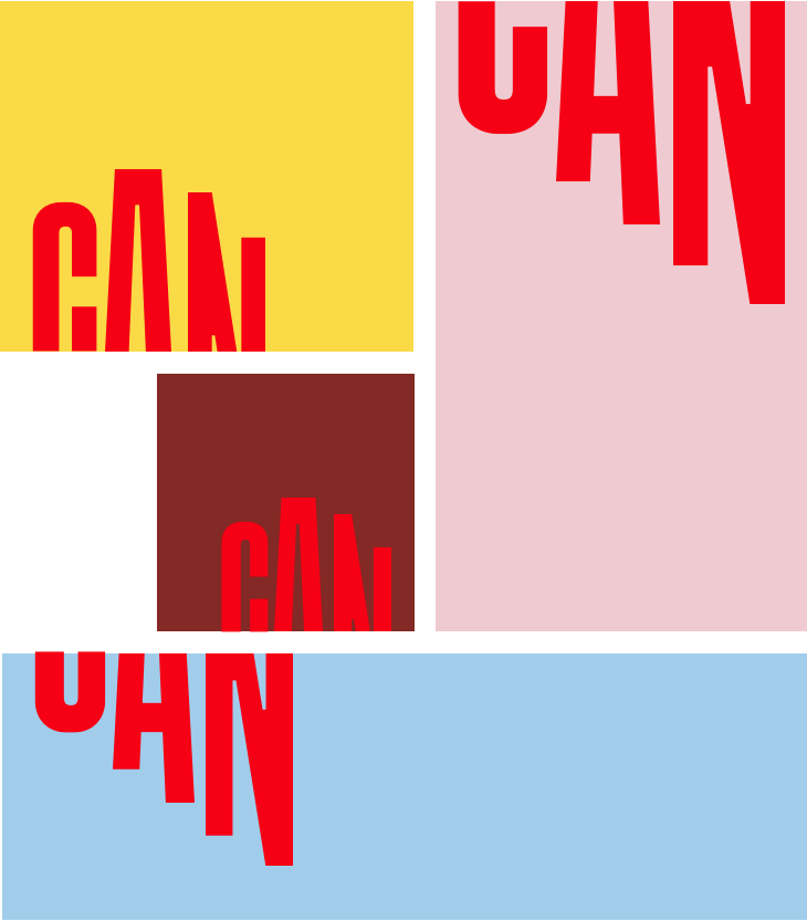
Used as a graphic device, only the first three letters of our logo—CAN—may be cropped. They can be cropped at the top or bottom, but they must be legible. Please note that they should never stand on their own; they should always be part of a bigger whole, so it’s obvious what they represent. Furthermore, use of the cropped logo should be limited and employed by DC only.

Only the first three letters can be cropped—never the entire logo
Below see other cropped logo examples on different colour backgrounds. The CAN must be in red or white, and red always has to play a dominant role. The cropped logo can be used in such things as PowerPoint presentations.
